Imagine creating a great app just to have it crash and burn because adequate steps weren’t taken to rid it of bugs and errors. This might happen because one essential stage of building a digital product was overlooked, quality assurance (QA) with UX/UI testing as one of the major steps.
QA is the stage where bugs and errors are detected and fixed so that your product is in its best shape and is working as it should. Testing and conducting QA on products as a separate stage is crucial because developers and designers see products through a different lens and can’t always make sure all usability criteria are met and all possible errors eliminated.
So, QA and testing should be done at every stage of creating software to determine the usability of a product in terms of its user experience as well as the user interface. This guide will discuss just that.
What Are UI, UX, and Usability?
UI and UX are often mentioned together but they are two distinct areas of software or digital product development.
Definition of UX
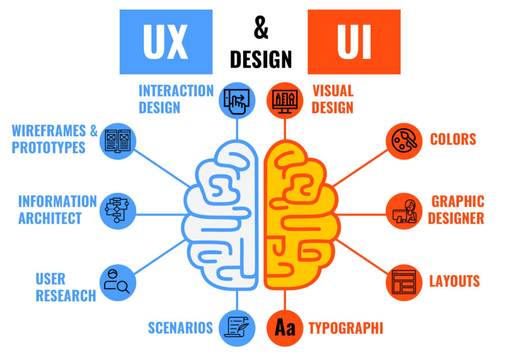
UX, or user experience is how people interact with an app. UX is mostly about prototyping and wireframing, architecture design, and interactions.
How do we want this to work? What features should be present on this or that screen? How do we make this work? These are examples of questions you might ask a UX architect.
For UX designers, it’s essential to understand how their target audience wants to interact with the app, how these people think, and what makes them feel good or bad while using an app. This also dictates how an interface will look in order to lead a user to a target action in the most natural way.
Definition of UI
UI, or user interface, on the other hand, is the graphical layout of an application or software. It’s mostly about layouts, colors, fonts, illustrations, and other elements of style you can see in an app, software, or a website.
What style do we want the app to have? What will this button/form/etc. look like? These are the questions you might ask a UI designer.
UI designers decide what an app will look like, from the color schemes to the fonts to the shapes of buttons. Most UI designers are also graphic designers and their job is to create aesthetic appeal for their application.
Difference between UI and UX design
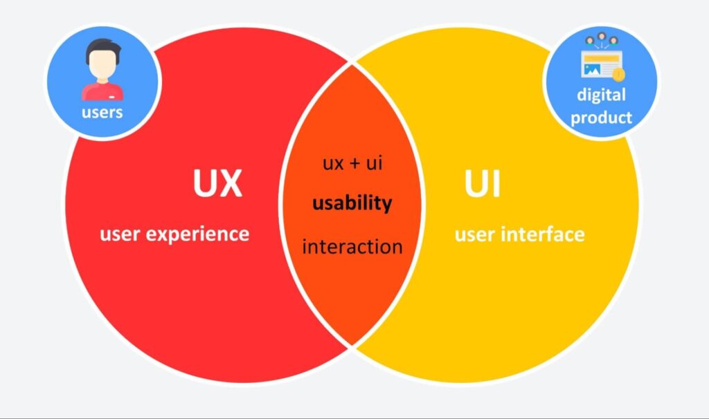
There’s a tight connection between user experience (UX) and user interface (UI). They are related, but not the same.
UI is more about design and implementation, while UX is more about the architecture and structure of the interface. So, normally, UX goes first.

All this leads us to usability—the foundation of design, the measure of how a good user interface facilitates a positive user experience.
What is Usability?
Usability means just how comfortable your software or website is to use for an average user.
- How easy is the learning curve?
- How quickly does a user get what they want?
- Is there anything annoying while using the app?
This is what usability is about in a few words, and it connects both UI and UX.
An interface should be intuitive – users shouldn’t need to go through a daunting onboarding process just to do a simple action, when everything is clear, quick and obvious to use.
And yes, this also refers to both simple and complicated apps, software, and websites. Complicated systems are where usability is especially important. For example, it’s quite difficult to create an unusable calculator because we all understand what it should look like and how it works, and even if the interface is not perfect, most people will know how to use it. But if there’s something more complex, like accounting or banking software, it’s very easy to create a cumbersome, overloaded, and buggy interface, and you might need an experienced usability testing company to do the job for you.

Does Usability Testing Equal Functional Testing?
Not really. While functional testing goes deep into whether all features operate well, software and website usability testing refers to how exactly they work and whether it is the most efficient way.
For example:
- A user can update their information on the website and it is successfully updated on the server. This is a “check” from the functional testing side.
- A user can update their information, but it takes five minutes to update. This is an issue that a website usability testing service may report.
The main focus of functional testing is assessing the workability of an app or software, whereas the main focus of usability testing is to make the app easier to use.
Pixel perfect? It will be once we’ve tested it.
Pixel perfect? It will be once we’ve tested it.
Why Usability Needs Quality Assurance
It might not seem obvious from the outside, but it’s impossible to just go and create a flawless app or website. Bugs and errors are always there until you detect and fix them, and this doesn’t mean your developers’ work is bad.
- Any interface, even in a very simple app, is a set of interactions. Different features created by different people, or just at a different time, may not connect with each other perfectly and cause errors.
- Apps and especially websites may be run on other platforms and devices, which may also cause unexpected issues that are hard to detect during the development process.
- And yes, human errors may also occur. Your team may have been working on the development of an app for a long time, and there may be things they haven’t noticed just because their eyes are blurred.
So, it’s not always obvious where a mistake may occur. You need “hunters” (professionals in UI and UX testing) who know how to find these big and small bugs that may spoil your users’ experience and who will report to the developers in the right way.
If UX and UI testing are an integral part of the product development process, you can implement quality assurance at each level, from the creation of a separate feature to the app release and updates, to make sure everything works right. You’ll fix problems as they arise, not after users report them to you.
Which, in turn, saves you time, increases the quality of your product, and helps you increase your customers’ satisfaction.
Stay ahead of web testing trends — subscribe to our newsletter for the latest tips and insights
What Are the Main Requirements for Web and App Usability?
There’s a standard list of requirements that fits most of the apps and if they are met, chances are high that your app or website will have a good usability score. These requirements, in a more or less equal form, are used by all professionals and vendors that provide usability testing services.
Accessibility
The product should be accessible to the largest number of its potential users. People with disabilities should be able to use it via assistive services just as easily as an average target user. People with different backgrounds and native languages shouldn’t have issues using your app either.
Perceivability
All parts of the interface should be easy to perceive and have alternatives. For example, if an image is unavailable, it should have alternative text or a caption so users can understand what it represented.
Another example is providing captions in video material and a transcript for audio.
Operability
This usability requirement concerns user activity and means that everything that is conceived should be possible to use, for example:
- All the features should be available and working.
- User needs to have enough time to read the interface and its content.
- The content should be physically safe (e.g. it should not cause seizures in predisposed people).
Ease of Navigation
On the same note, what makes an interface operable is good navigation, in any type of website or software, from the simplest to the more complicated ones.
Navigation should be made as simple, easy, and seamless as possible so that users don’t think about doing something, but just do it.
High Performance
To gauge the performance of your site or app, you need to be aware of the speed at which it loads pages and content, especially high-quality images. Text loads faster than images and illustrations, so the aim here is to make sure your product is in no way sluggish and loads within a matter of seconds.
And in terms of design, you should think about what’s happening while the content is loading. For example, the spinning wheel was introduced to interfaces so users know that something is happening and the app didn’t just freeze.
Understandable Interface
In an understandable interface, the content is readable – there’s no fine print or clash of colors. It also operates in predictable ways so users can avoid making mistakes.
For example, if a user is filling out a form and missing a required field, a window will pop up alerting them to the problem.
Responsiveness
Since handheld devices are used more than computers and laptops these days, it’s important to keep up with the times and adapt content and web design for phone use as well. This poses a web design challenge because most sites are designed with computers in mind.
Responsiveness is all about your site working smoothly and cleanly regardless of the device it’s opened on. You can even do this adaptation on WordPress, but it still needs to be tweaked to look as presentable as it would on a large screen.
Learnability
Learnability is the ease and pace at which a user picks up the ways to use a product. It used to be very common for user interfaces to require training to operate them but the current trend is toward creating UI that is usable for every kind of user, right away. This is why learnability is such an essential requirement; it makes sure that different kinds of users, including complete amateurs, can get on board easily.
Credibility
Credibility means that your product should inspire justified trust in users. This means people are trusting that:
- The product will do what it is intended (or expected) to do;
- It will do it in a safe and harmless way;
- It will be of the expected quality and do it in the expected time.
It’s simply impossible to deliver your product with its UI and UX if it is not trustworthy and people don’t trust using it. Users will just go elsewhere.
User-Friendliness
This just means that the UI should be a pleasure to use. This could mean aesthetically pleasing designs, quick navigation and loading times, and any other features that users love to see on their interfaces. This is such a big requirement because many users base their opinions about products and interfaces on how user-friendly they are.
Absence of Errors
This means that it should be virtually impossible to give wrong results when information is fed into the app or website. It should be bulletproof against the entrance of invalid data or unexpected user scenarios. The harder you make it to make an error in the first place, the better the error tolerance of your product will be.
Smooth Flow
A good flow is a combination of actions that follow seamlessly, exactly as a user intuitively expects it to be. Some examples of bad flow are:
- Unreasonably long processes with many steps and screens to pass;
- Unnecessary or irrelevant pop-ups between commands;
- Repeated steps or expected steps missed.
In terms of website usability, flow also means that one relevant page is followed by another relevant page without any additional information being thrown at the user.
Customization
It deeply depends on each app or website; however nowadays, we’re used to customized experiences and we expect a certain minimal level almost everywhere. This basic level includes the ability to manage such things as user names and avatars, color schemes, and timezones—it’s what we do in many apps, from email accounts to games. In more complicated apps, the expected level of customization may go deeper and include many more features, corresponding to the product.
User Engagement
Visually stimulating content that is fun and interesting to look at guarantees user engagement. Certain apps boast much higher user engagement levels than others and one huge reason for this is that they promote the kind of content that they know will garner the most user attention and engagement. This means that the majority of users should rate your app’s tools as fun to use.
UX and UI testing includes all these aspects, with UX involving architecture and experience and UI involving the design itself.
For example, during the UX testing stage, you might discover that there should be a confirmation pop-up after a user sends a message to support. Otherwise, they send a message several times thinking that something didn’t work.
At the same time, a UI tester might tell you the feedback form is designed in unpleasing colors and the fonts are difficult to read.
How Do You Perform a Usability Test?
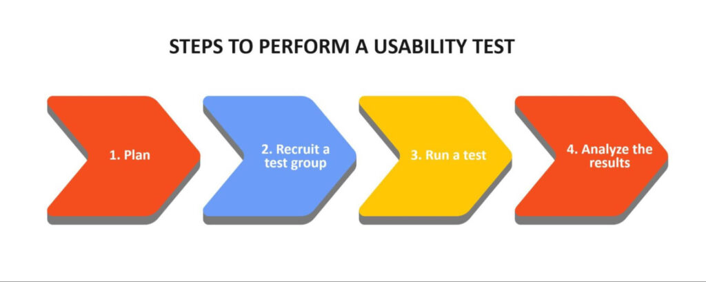
Whether you perform this stage in-house or involve a UI/UX-testing service provider, usability testing is done in sessions, each one dedicated to a certain part of the design. There’s roughly five phases in a session:
- Planning. This stage includes defining objectives, determining which exact part of a product will be the focus, choosing user personas to work with, and defining the exact tests to execute.
- Recruiting a test group. If you dedicated enough time to detailing user personas in the previous step, finding them in most cases is a matter of choosing the right source. If you have an established user base or social media following you can assemble a focus group from them. You can also reach out to your clients directly or hire from an agency.
- Running tests. When you’re ready to run tests, make sure that the focus group is comfortable and then perform the test. And don’t forget to record the results on video; it will help you analyze the data more deeply.
- Analyzing data. Once you get your data, it’s time to analyze it and determine the most serious and frequent issues. Based on this analysis, you can find solutions and improve the design.

Now let’s see how the test phase is actually done.
Methods of Usability Testing
There are several techniques that are applied by usability testing companies and professionals, depending on the specific target audience and available resources:
- Guerilla testing – going into public places, randomly choosing people, and asking them to participate. This method can be used in the early stages, when you already have a tangible design so you can determine if you are moving in the right direction.
- Lab testing – simulating scenarios in a controlled (lab) environment with a moderator. It’s useful when you need to see how real users interact with your product, however, you run the risk of forcing non-realistic user behavior.
- Remote testing – unsupervised testing in a natural user environment and probably the most realistic for a lot of companies right now. This method is handy when you want to validate a hypothesis on a large sample. However, this might not be your first choice, because unmoderated testing doesn’t provide insight on user reasoning.
- Card sorting – an easy way to test content and features by placing them on cards and asking users to sort the cards into categories. This is a good method for optimizing your navigation structure.
Can You Automate Usability Tests?
When it comes to functional and performance tests, it’s possible to achieve full automation. You may imitate user behavior or check technical data with automated testing to ensure each feature works as intended.
In usability (both UI and UX testing), it’s all about human behavior. You need to observe how people interact with a program and how they react, that’s why this type of testing may be only partially automated.
For example, you may automate data input and analysis, with UX testing platforms and additional tools, and get valuable data with apps like Hotjar or Userreport, but you cannot watch real-life user behaviour with any of these tools. So, manual tests are also necessary in usability.
At What Stage is Usability Testing Done?
Usability testing may be performed during different stages of the development process, including:
- Product concept;
- Wireframe, mock-up or a clickable prototype;
- Fully functional product (app, website, software).
Ideally, you should work with UX and UI testing professionals during all the stages, starting from the raw idea and implementing their recommendations during the process. It will help you save a lot of time and money by avoiding mistakes that will otherwise need to be fixed later, sometimes at a high price.
How Much Does Usability Testing Cost?
As in most IT services, the final cost depends on many factors, such as:
- The development stage;
- Costs of technology required to run a test (e.g. a UX testing platform, analytics tools, etc.);
- The necessity of competitive/comparative studies;
- App versions to test (e.g. mobile and desktop);
- Required sample sizes;
- Exact target audiences – sometimes they may be hard to find and invite;
- The number of markets and locations (e.g. you might need to perform studies in different countries).
It’s impossible to give an average cost for UI/UX testing. A simple app that is exclusive to iOS and only has four key functions across four screens can be tested in one week for under $1,000. Meanwhile, a complex CRM for a large business could take months to explore and require thousands of individual tests, running up a bill of $100k or more.
For a detailed estimate, it’s always best to reach out to your QA team and ask for a quote.
Don’t make your users choose between UX and functionality — start UX testing now
How Long Does Usability Testing Take?
Depending on the same factors that influence the price (development stage, user personas, markets, sample sizes, etc.) an average usability test for a product or wireframe may take between two weeks and two months.
Here’s how it breaks down:
- Estimation — After our first call, we take between 2-5 days to prepare an estimate.
- Preparation — The team will prepare a comprehensive list of test cases and scenarios, prepare traceability matrices, and create a timeline for testing the project. 1-3 weeks.
- Execution – We go over every button on every screen to ensure it fits with the overall design theme, is accessible, easy to find, and its function can be intuitively understood. Depending on the complexity of the software or website, this can take anywhere between two days and several weeks.
- Analysis — After the completion of each test we document it, write a bug report for all discovered UI/UX inconsistencies, and prepare documentation to be delivered to the development team for debugging and further development.
Conclusion
To sum up, usability testing in both UI and UX is an essential component of successful product development. It allows you to provide end users with a quality product that they will not only find useful but also thoroughly enjoy.
Any app or piece of software these days should provide a high quality, easy, and seamless experience, so it’s essential to have a strong QA component, such as a usability testing agency to ensure the quality of your app or website. Products that are not up to the mark in any aspect are often driven out of the market as soon as they arrive.
You can achieve a smooth interaction between a user and an interface by adopting the skills of TestFort. More than 800 projects were improved together with our team during more than 19 years of experience, and we’ll be happy to help you create a great error-free product.


